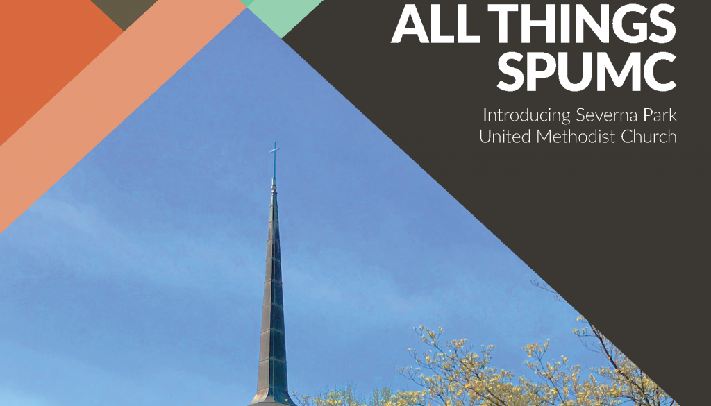
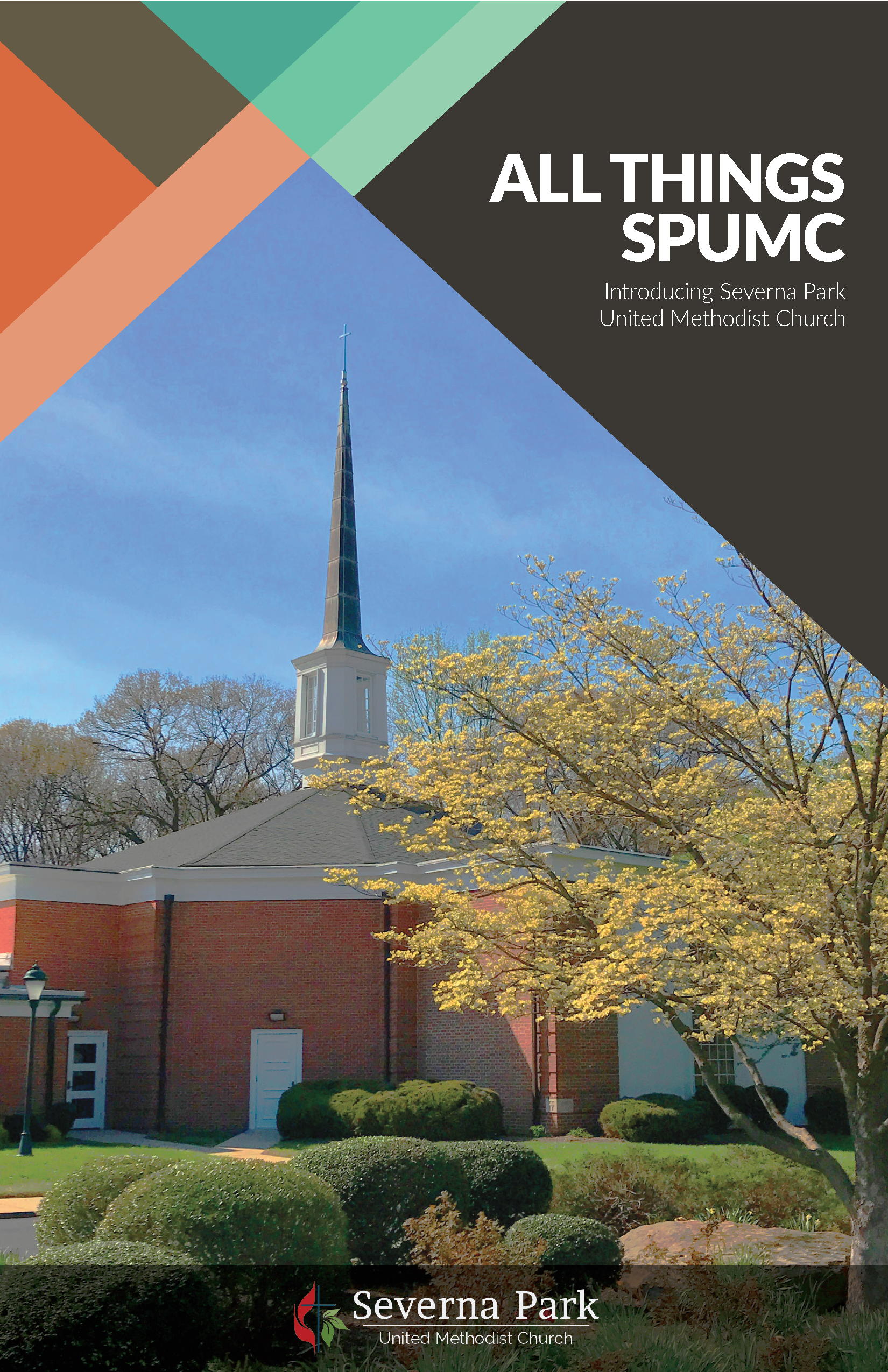
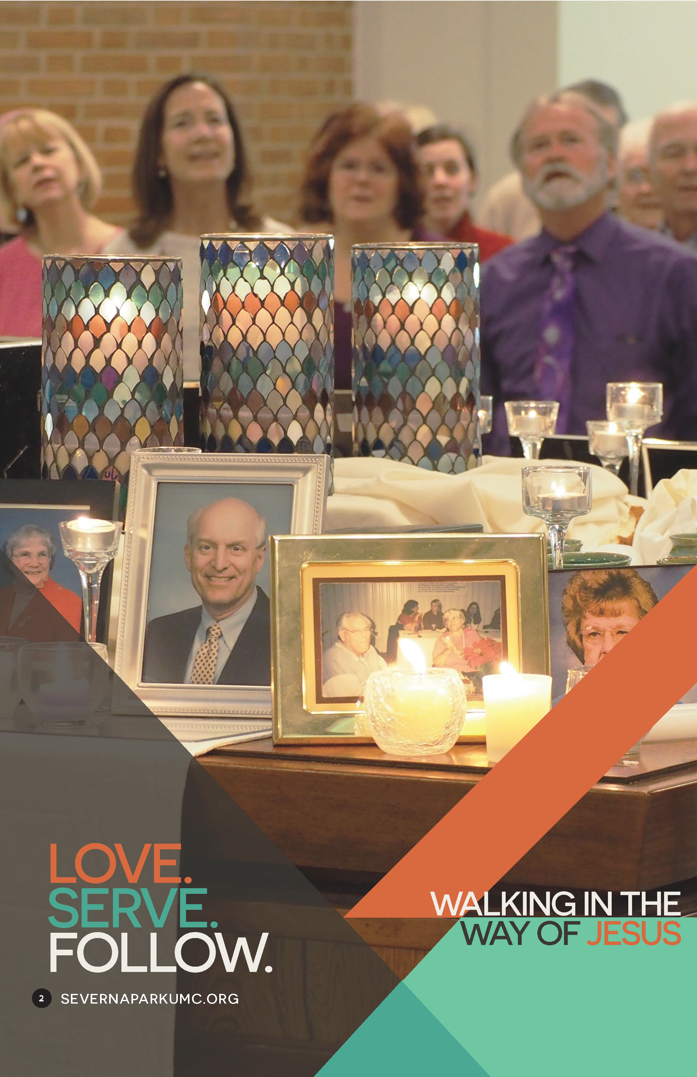
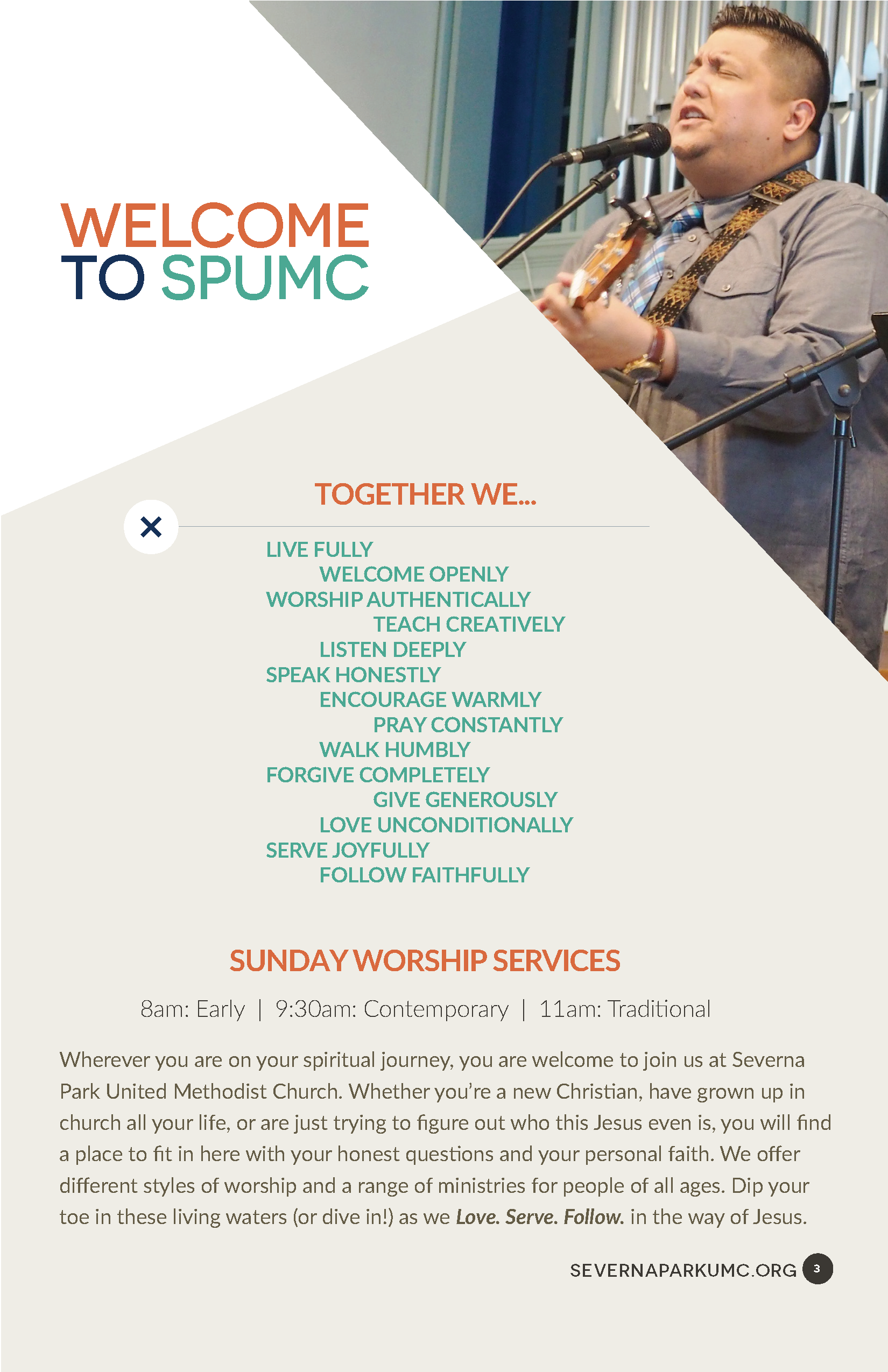
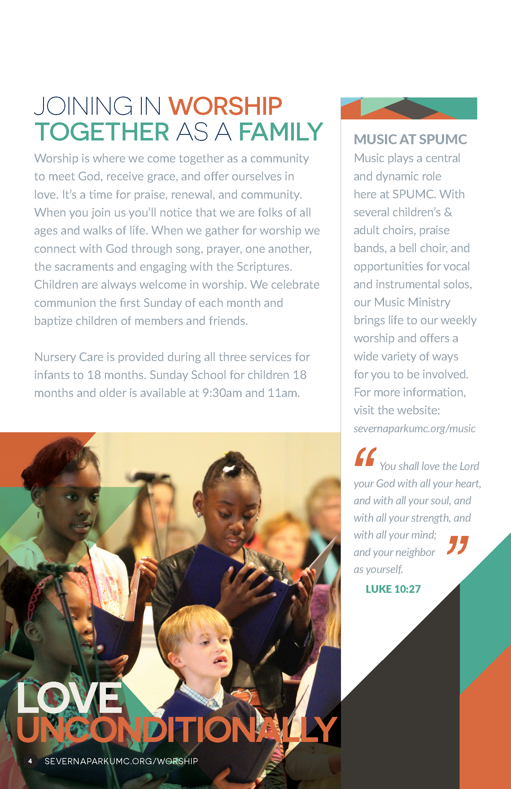
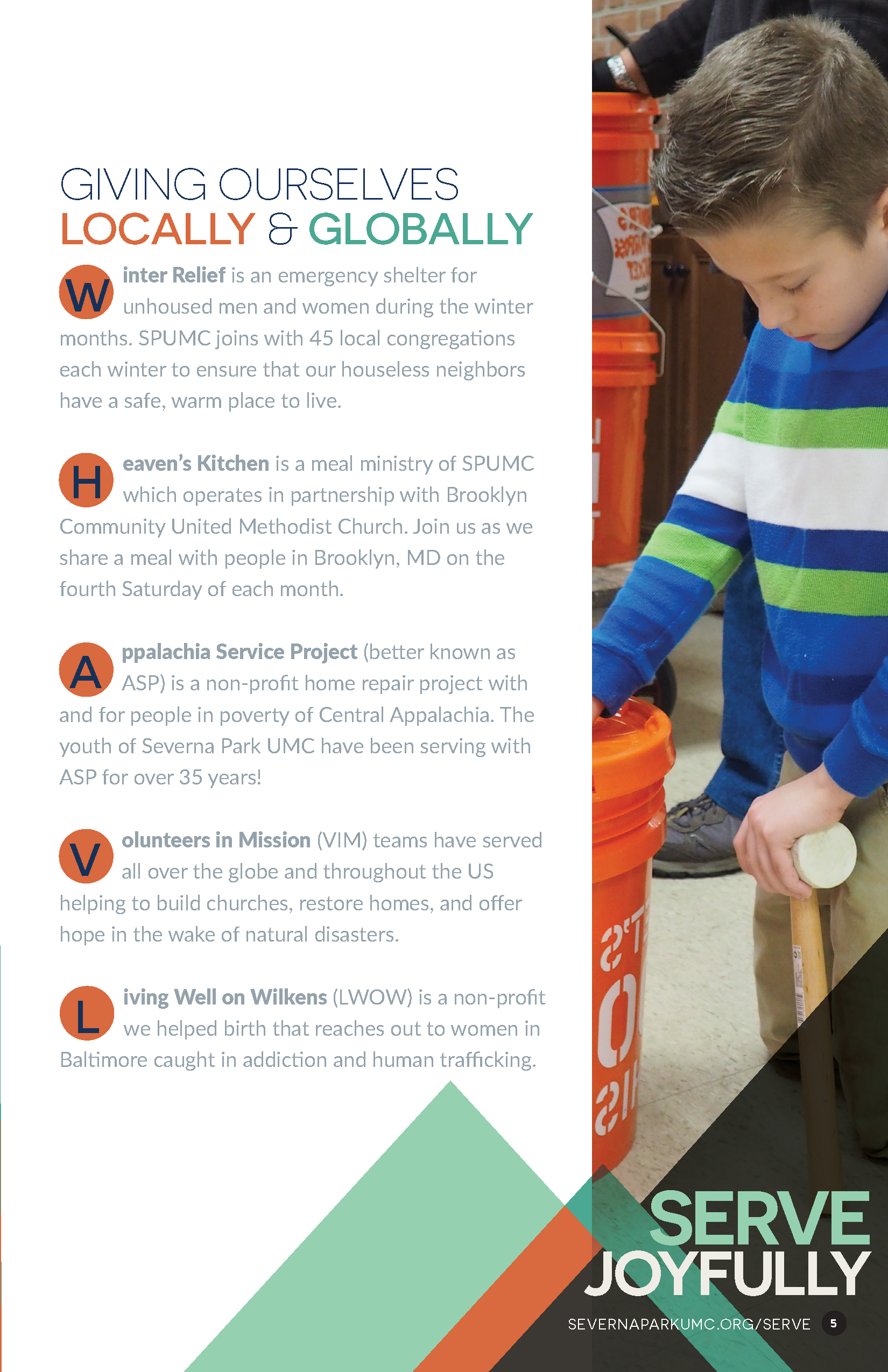
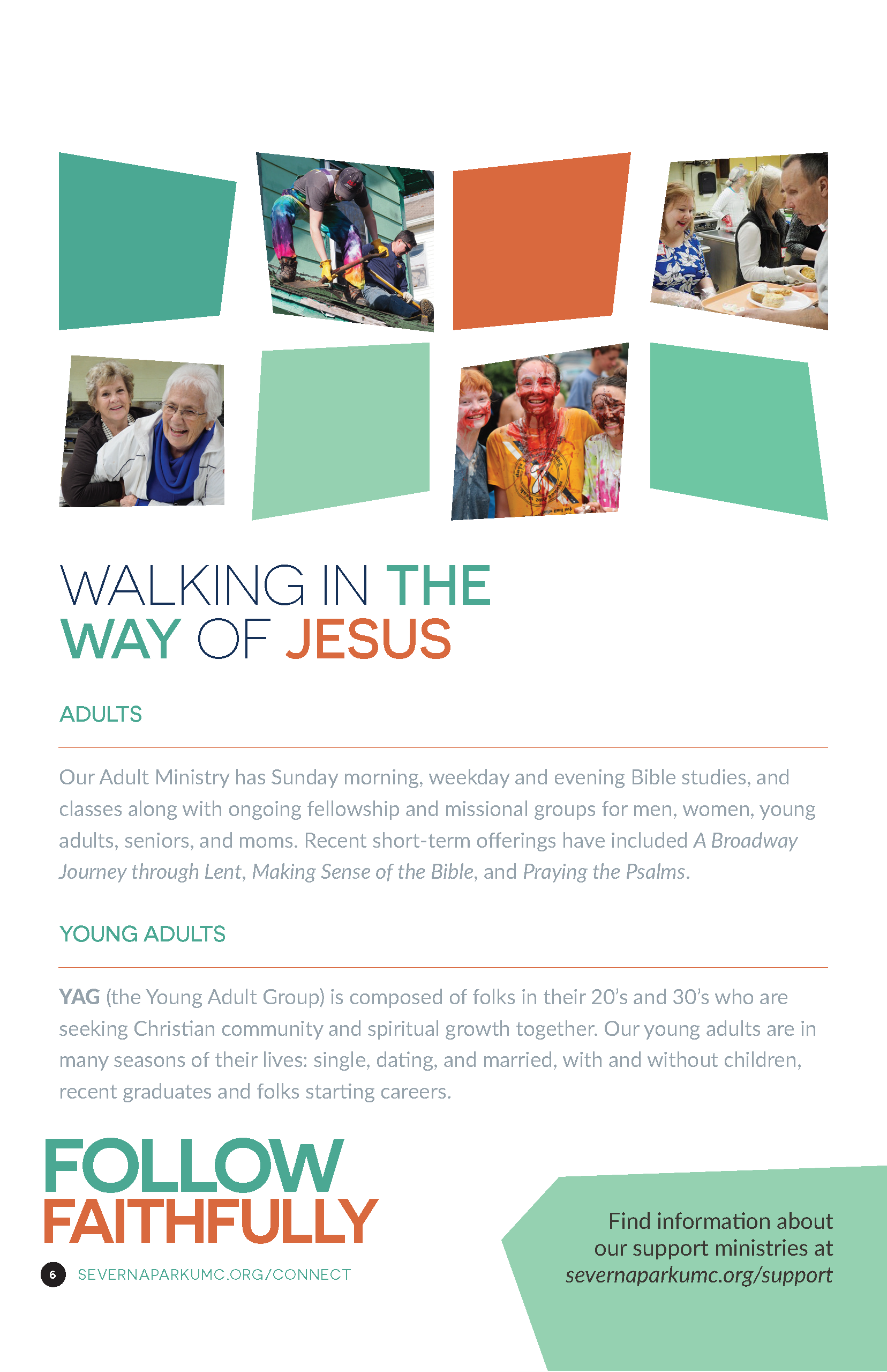
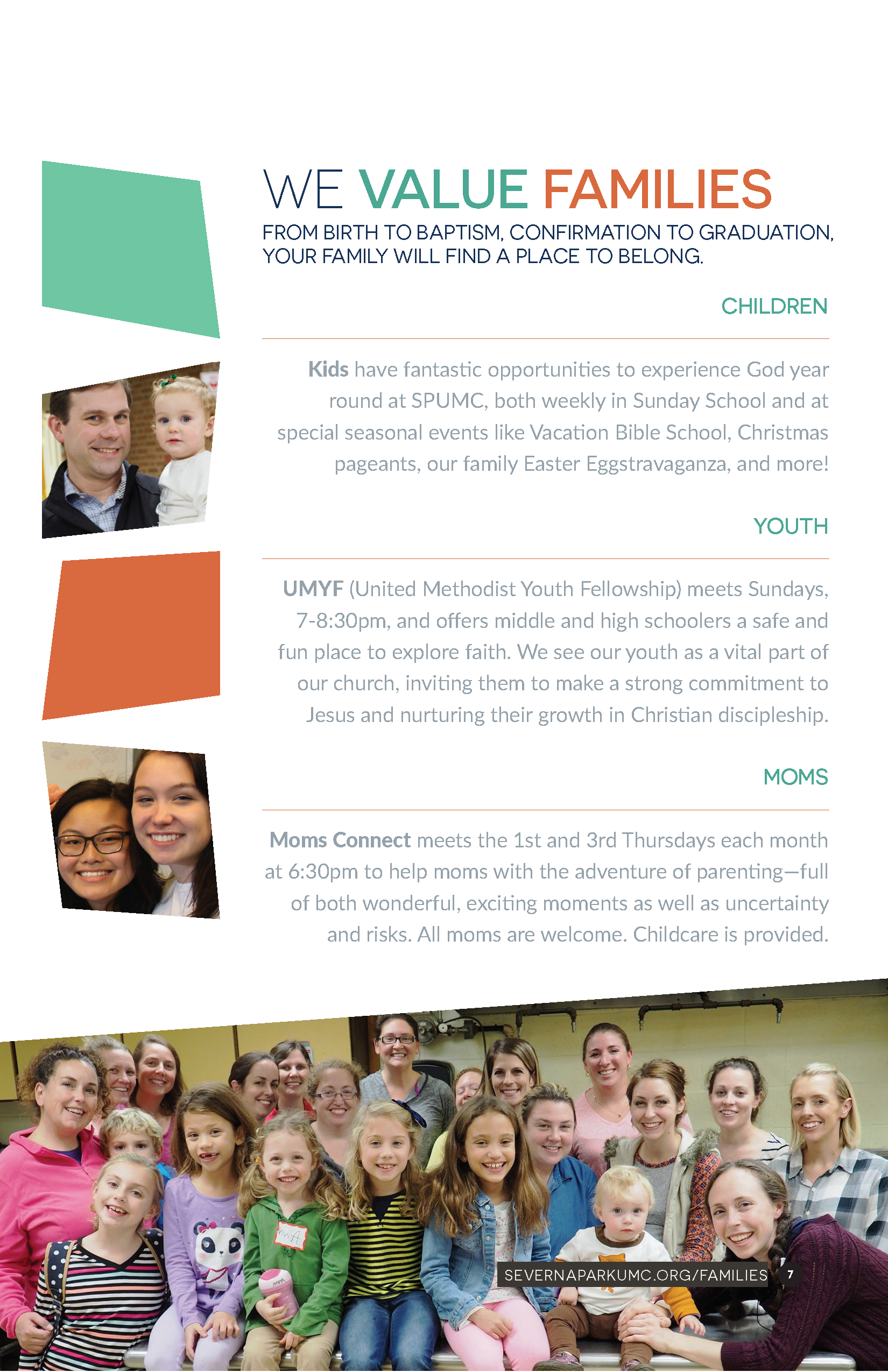
This brochure is half letter size (5.5″ x 8.5″) and is designed to give guests an overview of Severna Park United Methodist Church and its offerings. After speaking with the church leadership, I also took the opportunity to infuse a bit of energy into the brand’s colors and typeface usage. The geometric patterns create a visual sense of activity and movement, and the oranges and teals reference the ocean flavor that permeates the community in which the church resides.
