I was thrilled when my good friend, Chris Bissette, approached me about redesigning his award-winning RPG blog website Loot the Room. Chris is always producing great tabletop roleplaying game content, and I jumped at the opportunity to help make his site easier to use, while also giving it a fresh coat of paint. Go check it out!
I recently had the exciting privilege of being commissioned for the successfully kickstarted Salt In Wounds fantasy setting city map for D&D and Pathfinder. More
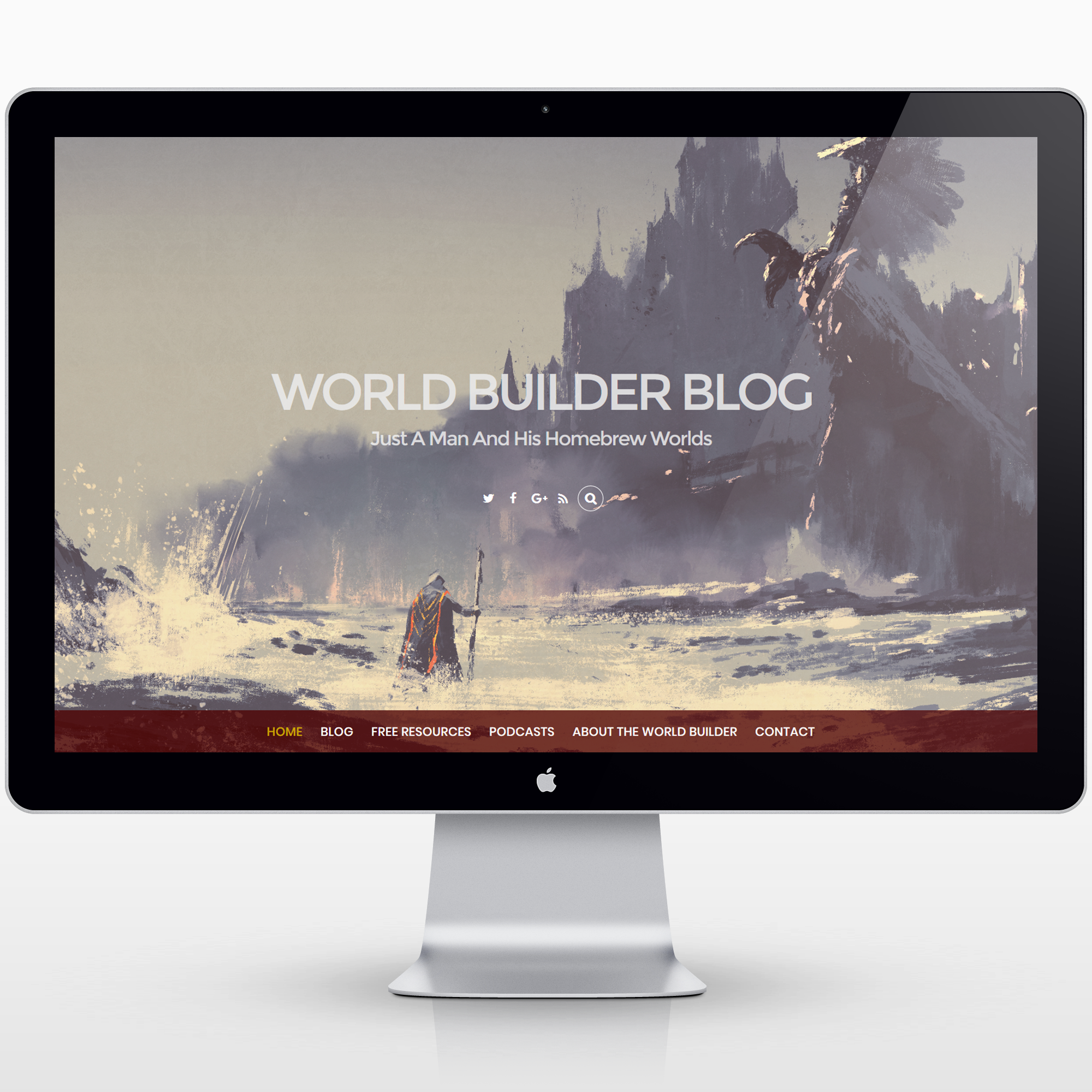
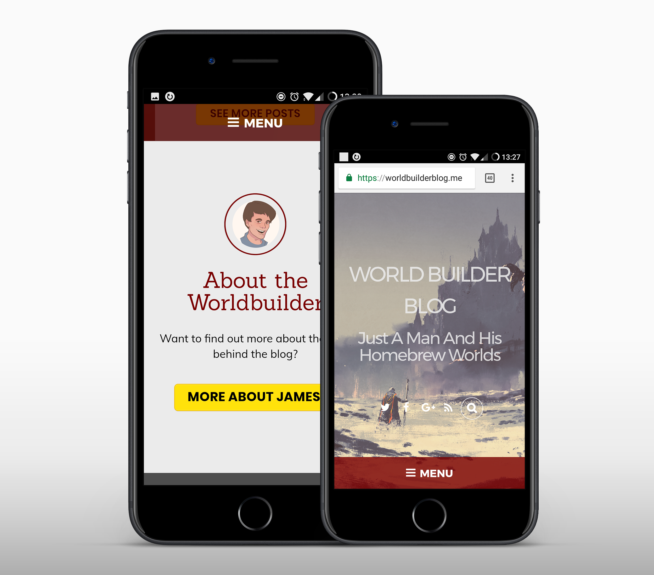
I recently had the privilege of working with James Introcaso to redesign his Ennie-winning website, World Builder Blog. James was a pleasure to work with.
My first published black & white world map, the world of Ashtalon is a private commission map of the fantasy world created for a home Dungeons & Dragons campaign.More
This logo was chosen by the people from TabletopLoot.com from a final slate of three options to represent their company.
The hexagon outline shape allows the isometric text to give the indication of a three dimensional cube, thus referencing six-sided dice. It also nods to the overall shape of a 20-sided die.
The font I used, Righteous, gives a sort of other-worldly feel, allowing people to associate the brand with the science fiction and fantasy games that TTL supports with their products. Simultaneously, it’s not essentially any particular genre, which gives the company flexibility going forward with product direction.
Hopefully soon I’ll be able to write up a post describing the whole design process of this logo, as I’m pleased with the way it turned out.
I realized I didn’t have a good example of an original layout or document design for roleplaying games. This is a design template I’m working on for an upcoming rpg adventure module project to be launched on kickstarter later this year. The module, as you might guess, is sea-themed.
It’ll still get tweaked some before the final version. I’ll be sure to update here when the project goes live.